Web design system: enrollment redesign
Redesigning the first touchpoint of the member journey, from design system foundations to shipped screens.
Overview
Omada Health is a virtual care provider helping members manage chronic conditions like diabetes and hypertension through personalized coaching and behavior-change tools.
To join Omada, every new member fills out a web intake form covering personal info, health history, and insurance. It's a prospective member's first impression, and it hadn't kept pace with the product. I led the redesign end to end, with three goals: build the infrastructure for fast experimentation, bring web up to par with mobile, and cut abandonment by fixing low-lift, high-friction UX.
-
Product design
App architecture
Product strategy
End to end release -
Figma
Figjam
Miro
Claude
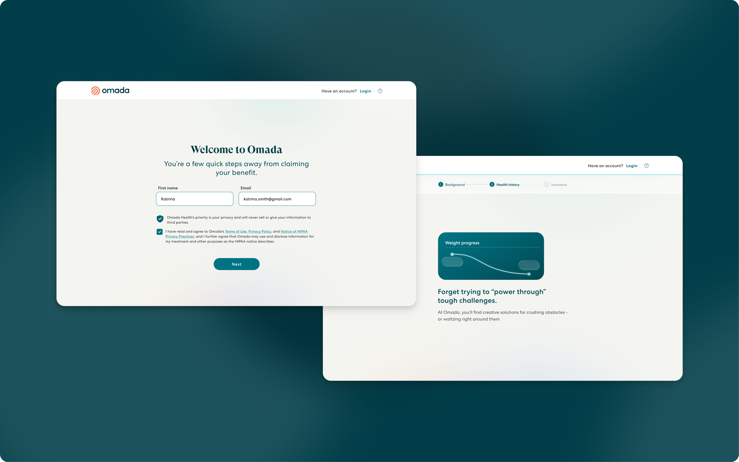
01. How it all started
I joined the onboarding team in early 2026 to lead experimentation projects to quickly ideate, test, and iterate to improve upper-funnel enrollment metrics. But the way the entire enrollment flow was built couldn't support the quick experimentation process:
No design infrastructure. No web design system, no componentized implementation. Engineering built UI from scratch for every test. The team couldn't iterate at the pace leadership demanded.
A fragmented experience. The flow's visual language predated the current product, so every experiment clashed with the screens around it. That inconsistency became a confound: when a test moved metrics, we couldn't tell if it was the idea or the visual mismatch.
Known friction, unaddressed. The flow carried years of UX debt that likely drove abandonment. No one had mapped it or prioritized fixing it.
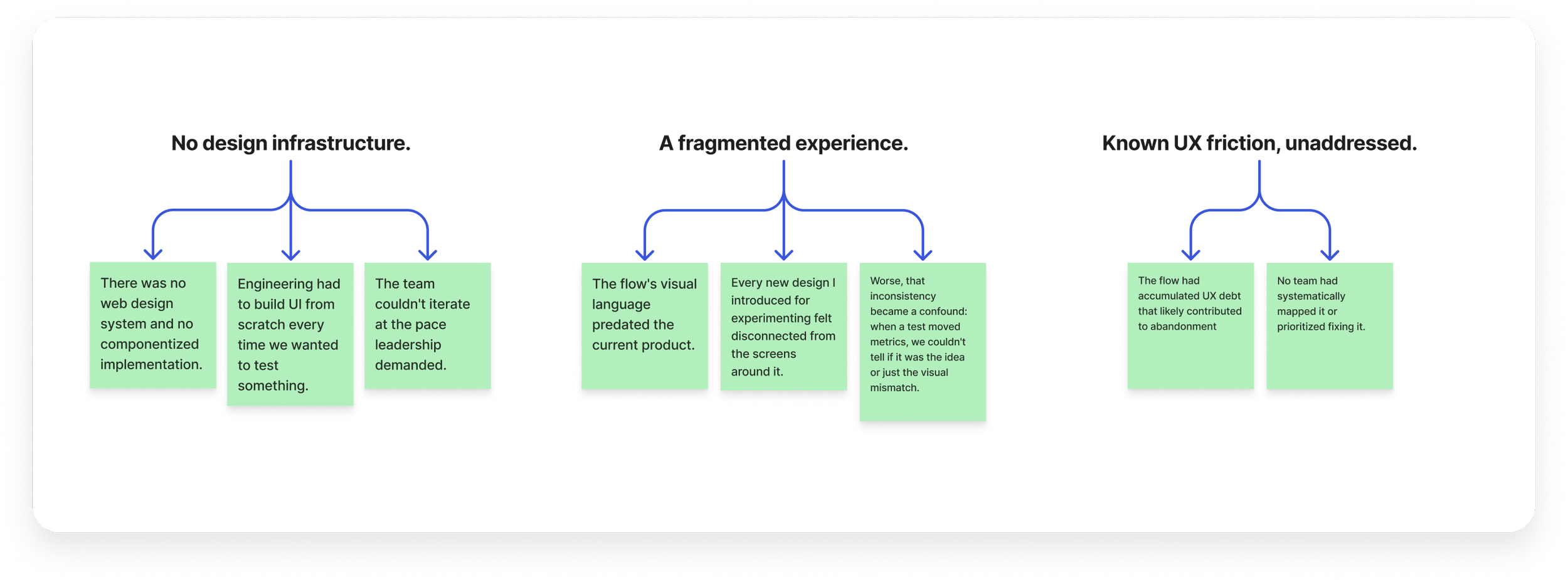
I made a call that we paused our plan for experimentation so that we can rebuild a stronger foundation, which would set the team up for faster experimentation ahead.
My Role
Made the case to leadership to pause experimentation and rebuild the foundation first
Built Omada's first web design system, translating the mobile design language to a new platform
Facilitated the discovery workshop that aligned product, engineering, and design on the UX problem set
Sequenced components by priority so engineering built P0 while I designed P1. No one waited on a finished system
Kept a decision log documenting the rationale behind every major call, which kept the team aligned as the flow scaled
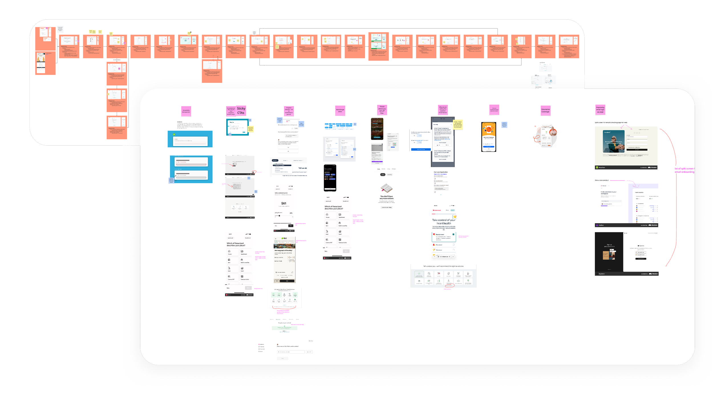
Workshop artifacts: ux audit + trendscrape
0.2 Discovery: UX audit findings
To kick off the redesign, I led a collaborative workshop with our product manager and engineer to audit the existing flow and surface UX gaps before moving into design. I set a clear scope with the team: componentize the designs, build the library, and keep the flow's structure intact. Not every problem needed solving now. We'd fix the friction that fit inside that boundary and log the rest.
Below are the key UX problems we aligned on, grouped the way we tackled them:
CTA buttons disappear on scroll. On both mobile and desktop, primary action buttons scroll out of view, forcing users to hunt for the next step.
No sense of progress through the flow. No indication of where users are or how much remains.
Selection patterns are ambiguous and hard to parse. Unclear whether a question expects one answer or several, and whether a selection registered.
The flow is inaccessible across devices and input methods. Gaps in keyboard navigation and screen reader support mean some users can't complete the flow at all.
Jarring page transitions break the navigation flow. A shake animation fires on every page load.
Enrollment flow feels visually disconnected from the Omada product. Visually inconsistent with the broader product, undermining trust at an already high-stakes first touchpoint.
0.3 Building the foundation
With the UX fixes identified, it was time to build.
I categorized every flow in the intake form into page types, then identified the components inside each page. For each component type, I laid out every page variation it would need to serve. This step was important: instead of designing a component and hoping it held up across the flow, each component met its full set of real pages from the start.
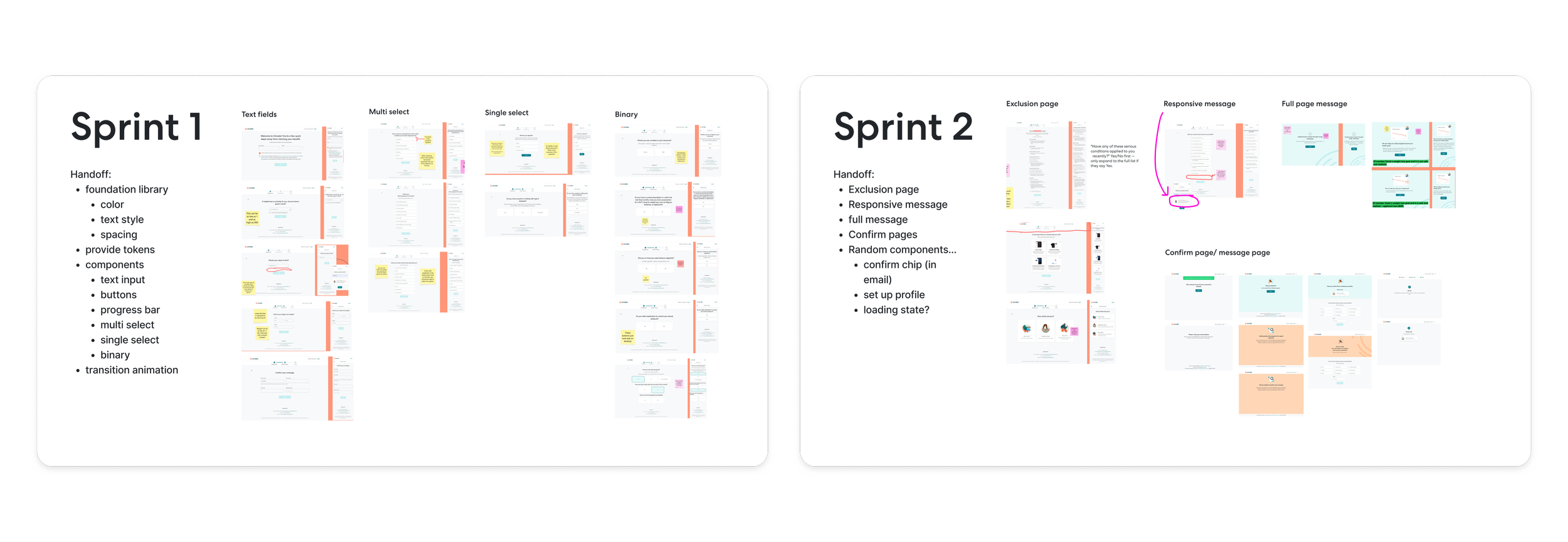
The mapping did two things. 1) It help identify every state while I created tokens and components, and 2) it gave engineering and me a shared artifact for breaking the work into 2 sprints that were actually feasible to build.
0.4 Design system + token
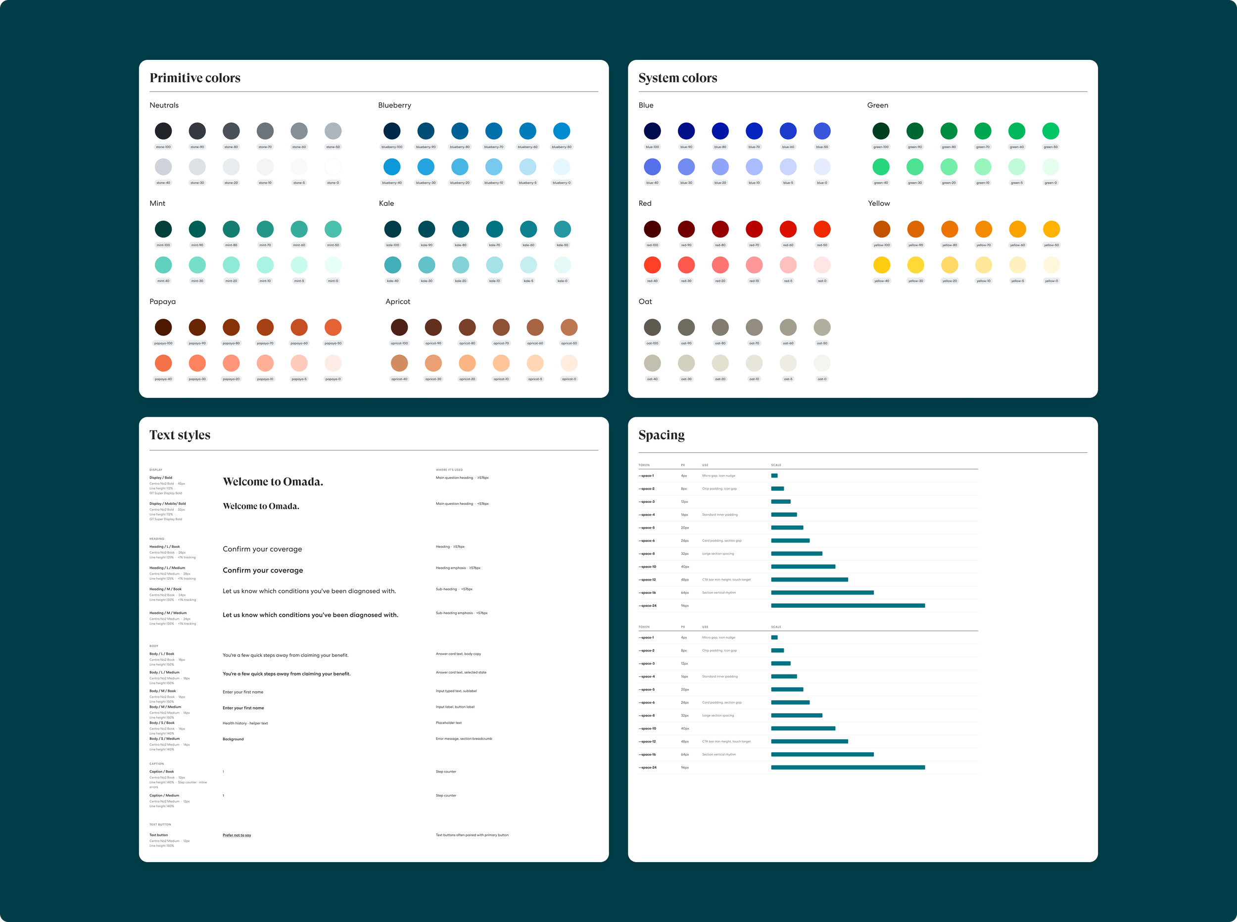
Primitive & system colors: I started from the mobile system's foundations and scaled down to only the palette enrollment needed. A smaller system is an easier system to keep consistent.
Text styles: I needed a system that could scale responsively across display sizes. I defined a semantic type scale (display, headings, body, caption) rather than one-off sizes, set in relative units so member browser settings are respected, with each role ramping across our four breakpoints. One style name, four responsive behaviors, zero per-screen decisions.
Spacing: I kept the 4px grid from the mobile system.
0.5 Creating components
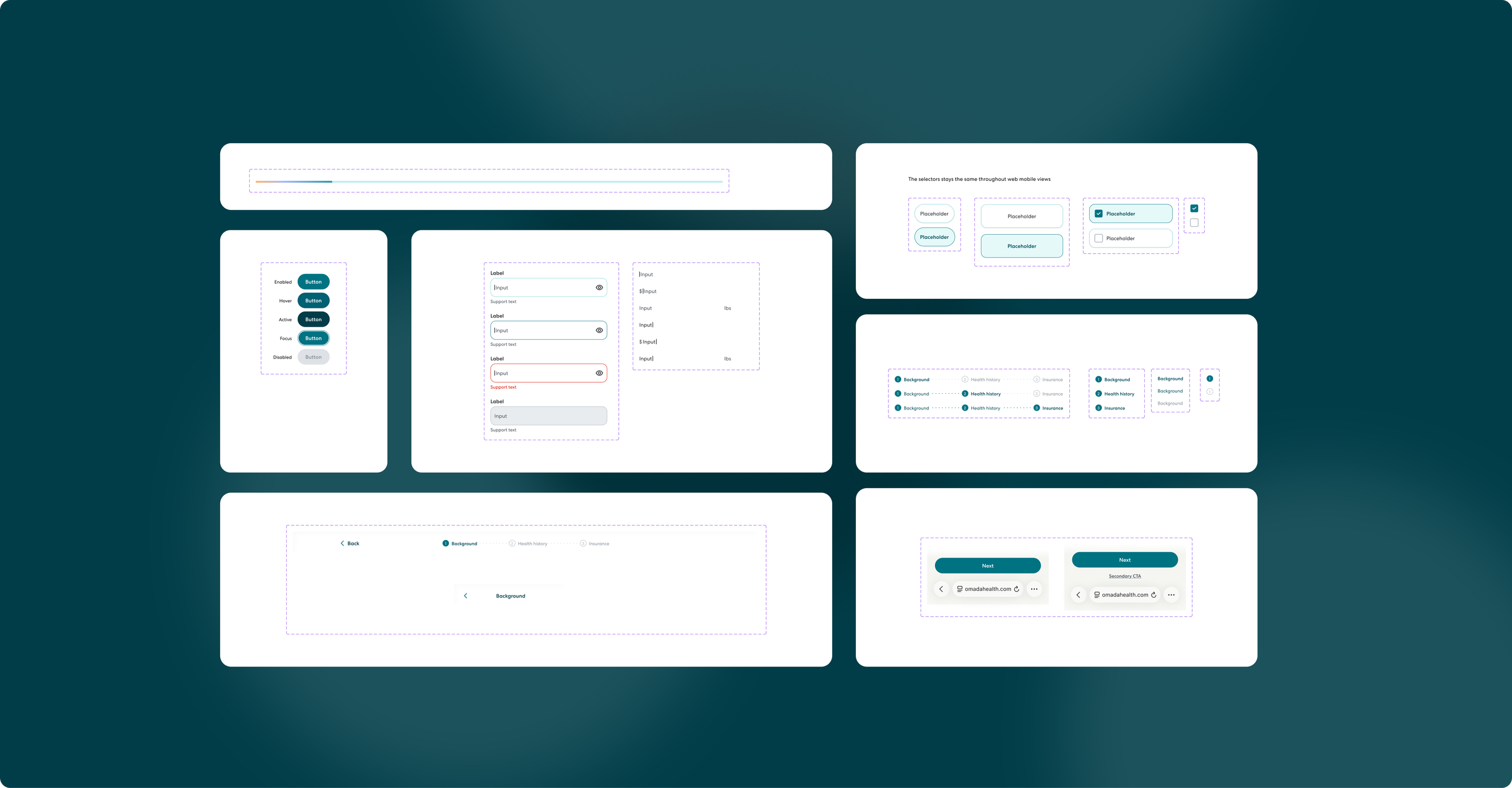
With foundations set, the component work was dozens of decisions, each one a chance to reduce friction referring back to the UX fix list we identified as a team earlier. I kept a running decision log with the rationale for every call, which kept the team aligned and made tradeoffs explicit.
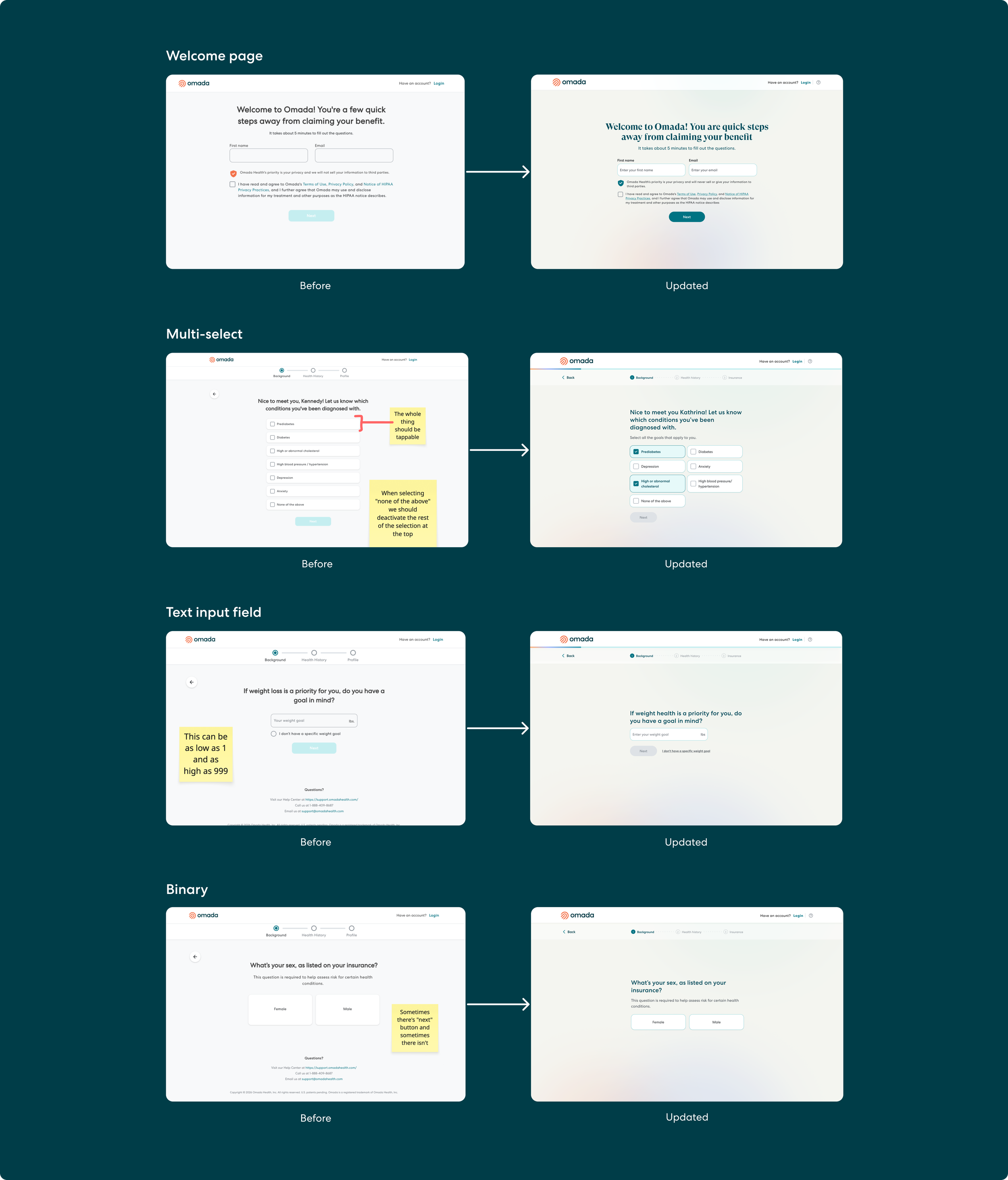
Binary select
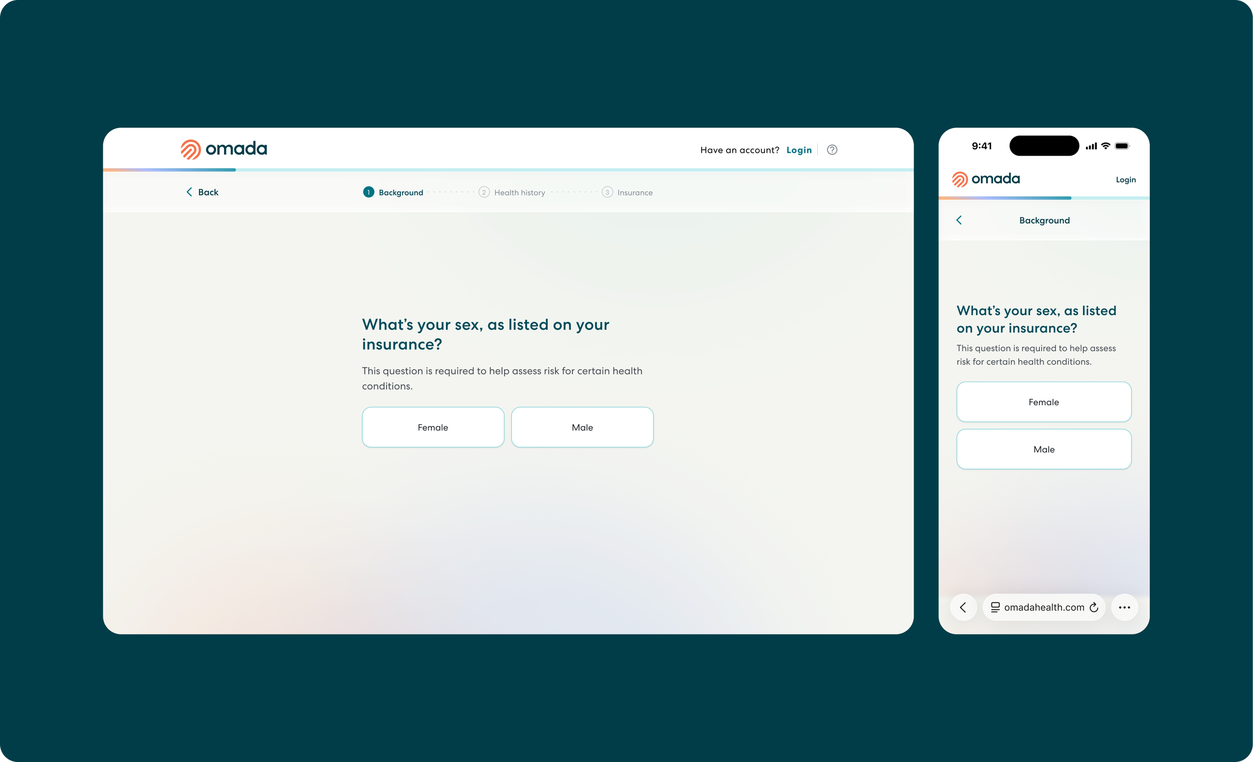
When there's no button at all. Binary and single-select questions auto-advance the moment you tap. The selection is the confirmation; a Next button would be a redundant tap. Multi-select questions keep the button, disabled until at least one option is selected, because users need to commit when they might pick several. Fewer taps per screen, across 20 screens, adds up.
Multi-select
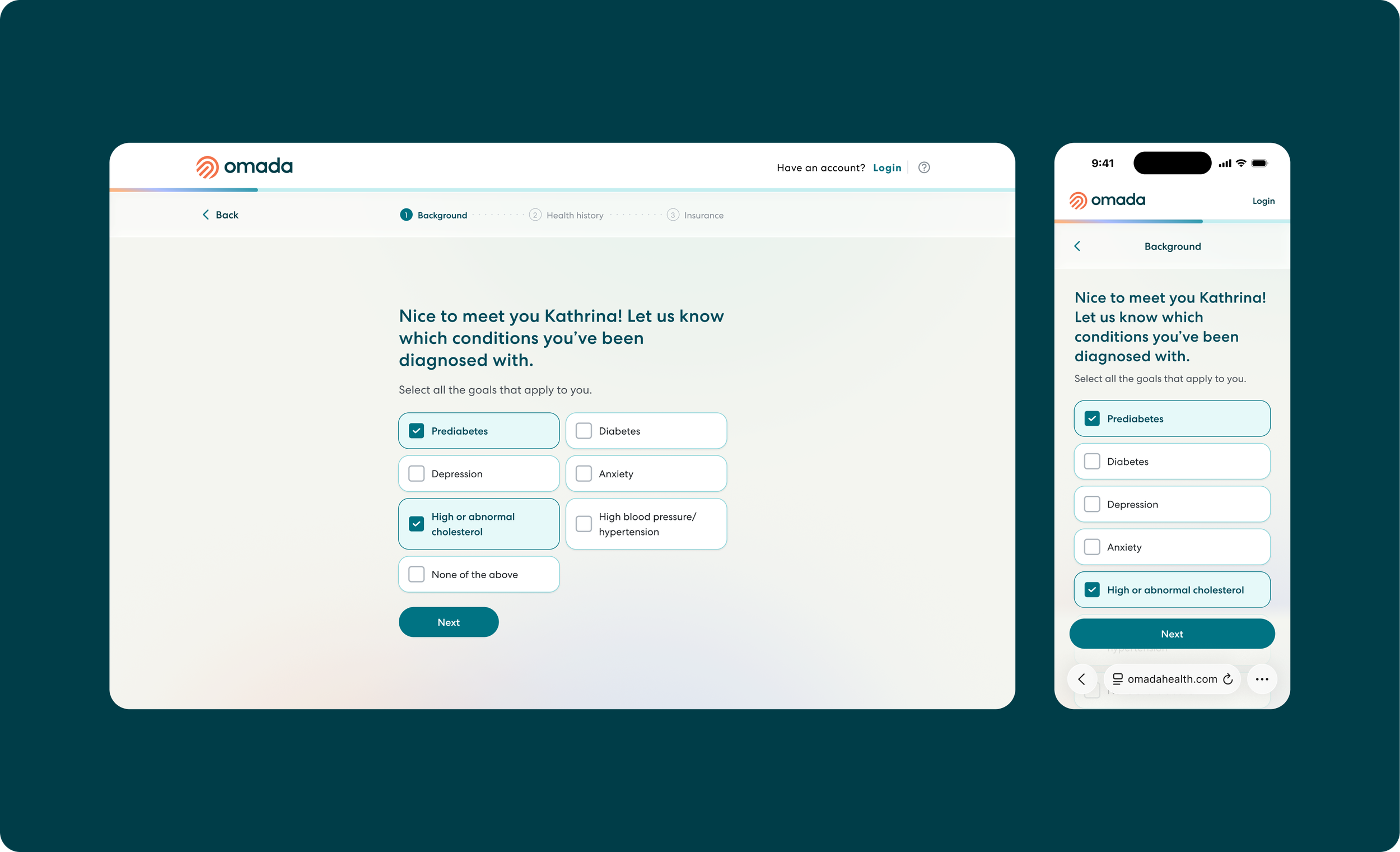
Selection without ambiguity. Multi-select are now visually distinct components, so members know at a glance whether a question expects one answer or several, and selected states read unmistakably.
No more scrolls for buttons. The old design had one column list that often pushed down the primary cta button below the scroll for desktop. With introducing two column, the primary cta stays above the fold, making it easily accessible for members to move on to the next question without having to scroll to get to the cta.
Text input
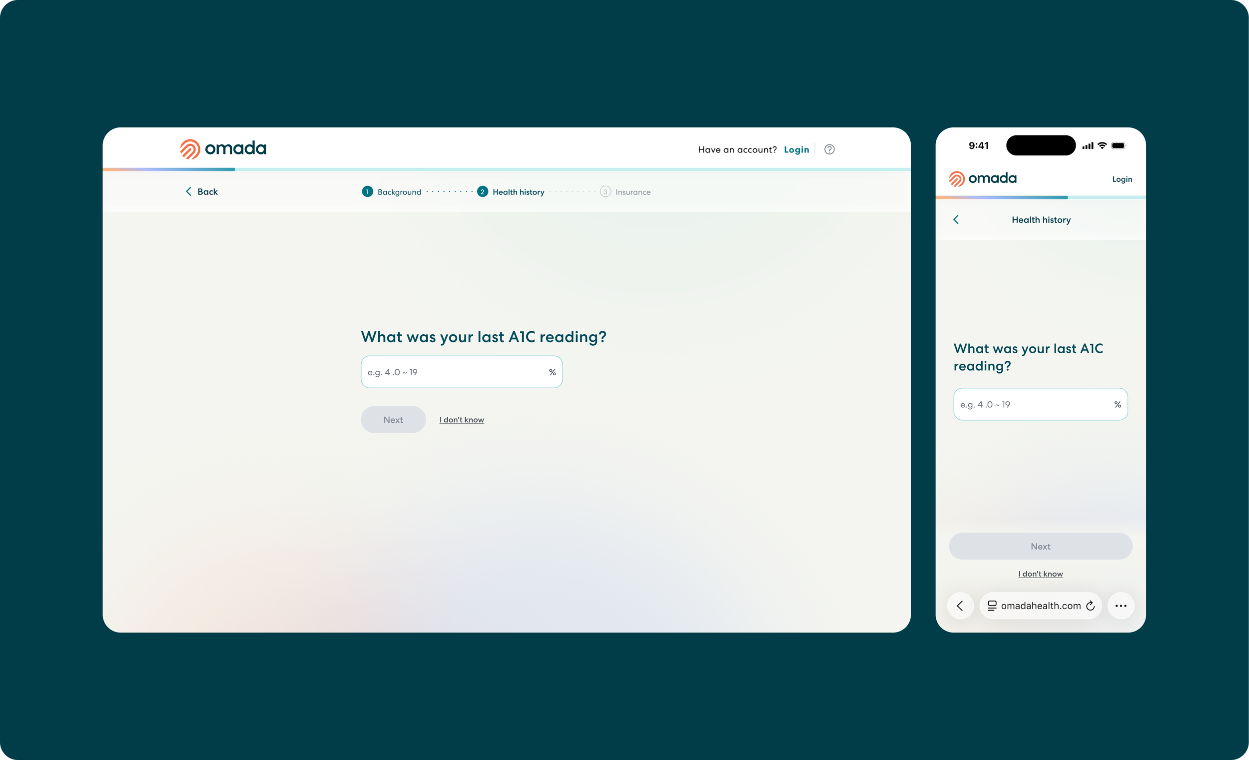
One input height, everywhere. 56px on both mobile and desktop. Desktop could technically go denser, but this form is the whole screen, not a widget embedded in a page. 56px clears the WCAG touch target minimum with room to spare and means one component to maintain. Dropping to 48px on desktop wasn't worth adding a two-size component against our deadline. Logged as a post-launch revisit.
A contrast call with context. The resting input border doesn't meet the 3:1 WCAG contrast threshold in isolation. But no input in this flow exists in isolation: every field has a clear question above it, placeholder text inside, and supporting context below. The border is never the sole means of identifying the field. The focus state, which is the accessibility-critical moment, fully meets the threshold. Accessibility guidelines are about whether users can perceive the interface, not about passing every check on every element out of context.
Separate text input
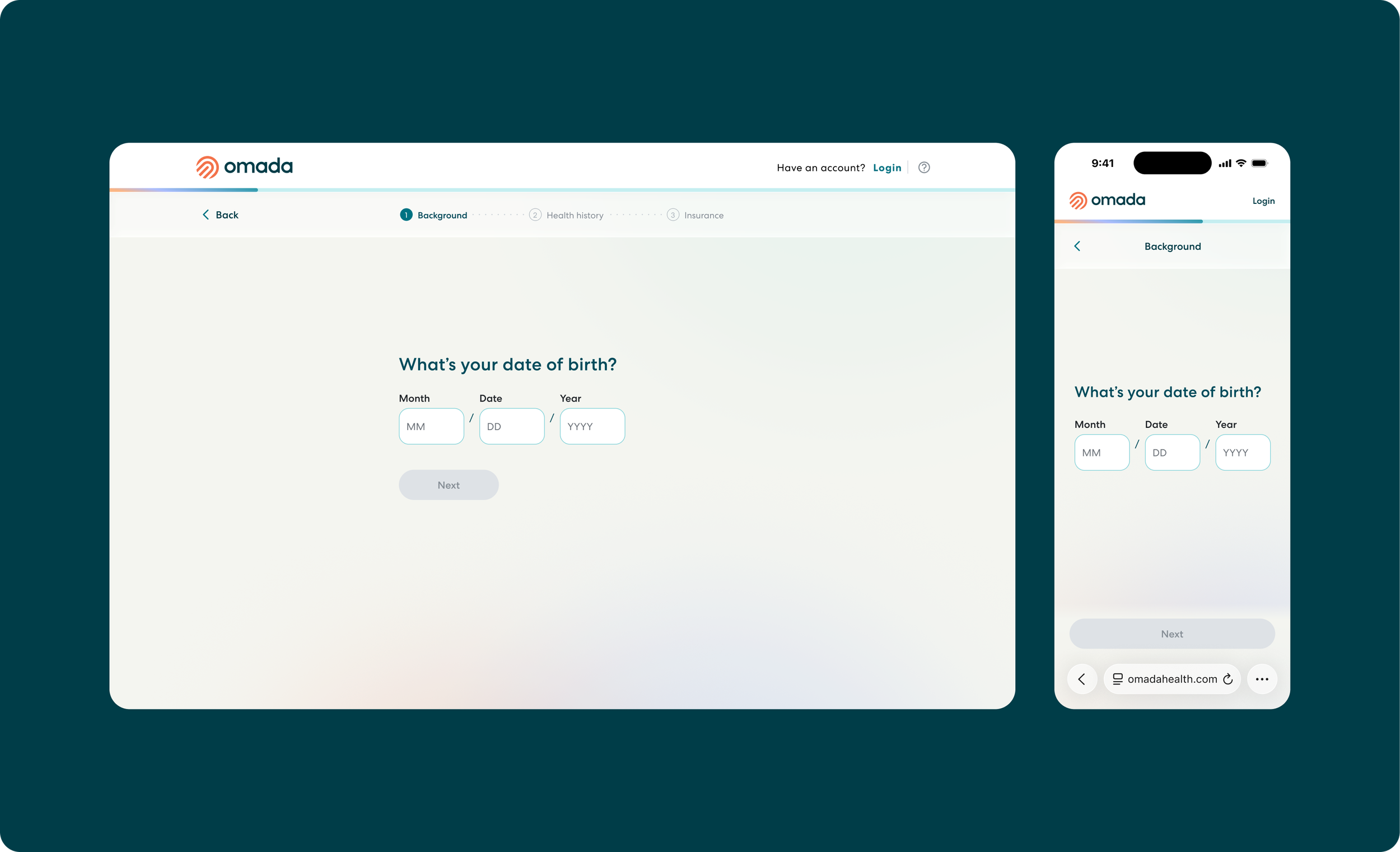
The birthday input. Three separate fields (MM / DD / YYYY), not a date picker or a masked input. People know their birthday by memory; no one needs calendar navigation to find 1987. Masked inputs have patchy screen reader support. Three fields enable auto-advance: two digits in the month jumps focus to the day, then the year. Fast, keyboard-friendly, and the same pattern SSA and TurboTax use. Persistent labels above each field, because placeholder text disappears the moment you start typing.
Before and after side by side
0.6 Transition animation prototype
This is a short flow version to illustrate how the content moves through the flow + show case how different components behave.