Omada Goals Redesign
Redesigned Omada's goal-setting experience to support multiple health goals at once, increasing subsequent goal-setting by over 10%.
Overview
Omada Health is a virtual care provider helping members manage chronic conditions like diabetes and hypertension through personalized coaching and behavior-change tools. I led the redesign of Goals, one of Omada's core features, partnering closely with Product, Engineering, Clinical, UX Research, and Content Design.
-
Product design
App architecture
Product strategy
End to end release -
Figma
Figjam
Miro
01. How it all started
"I want to work on my food and my activity, not choose between them."
This sentiment came up repeatedly in member feedback. Omada's core promise is helping members build sustainable habits across food, activity, and sleep, all in service of long-term outcomes like weight loss. But the goal feature only supported one at a time. As we shipped features meant to make goal-setting easier, like an AI motivational agent and community goals, the limitation became harder to ignore. Leadership was hearing the same thing: members needed the ability to set more than one goal.
Having spent over 7 years at Omada, I knew this brief wasn't a simple feature update. It meant rethinking the goal experience from the ground up.
So, what’s the experience goal?
The work will focus on enabling our members to 1)pursue multiple goals and 2) ensure existing flows still works while supporting the new updated experience.
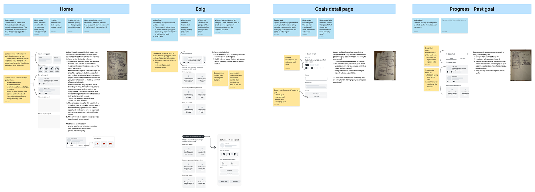
Initial pov on existing flow updates. The brain dump helped identify initial questions we needed to test.
Supporting multiple goals wasn't a simple toggle. The existing experience had to keep working while I reshaped it into something members could realistically manage with more than one goal at a time. I started by mapping out the points in the existing flow that would break or need rethinking, along with a list of open questions. From there, I leaned on research to validate those assumptions and surface gaps I hadn't considered.
02. Research
We interviewed 7 members to understand what was and wasn't working in the current experience, and how they envisioned managing multiple goals going forward.
Key findings:
Most, if not all, members loved the idea of being able to set multiple goals
Members wanted guardrails to prevent overcommitment, but still valued flexibility
Goals needed to stay visible on Home, out of sight meant out of mind
Some members needed more than a week to build a habit
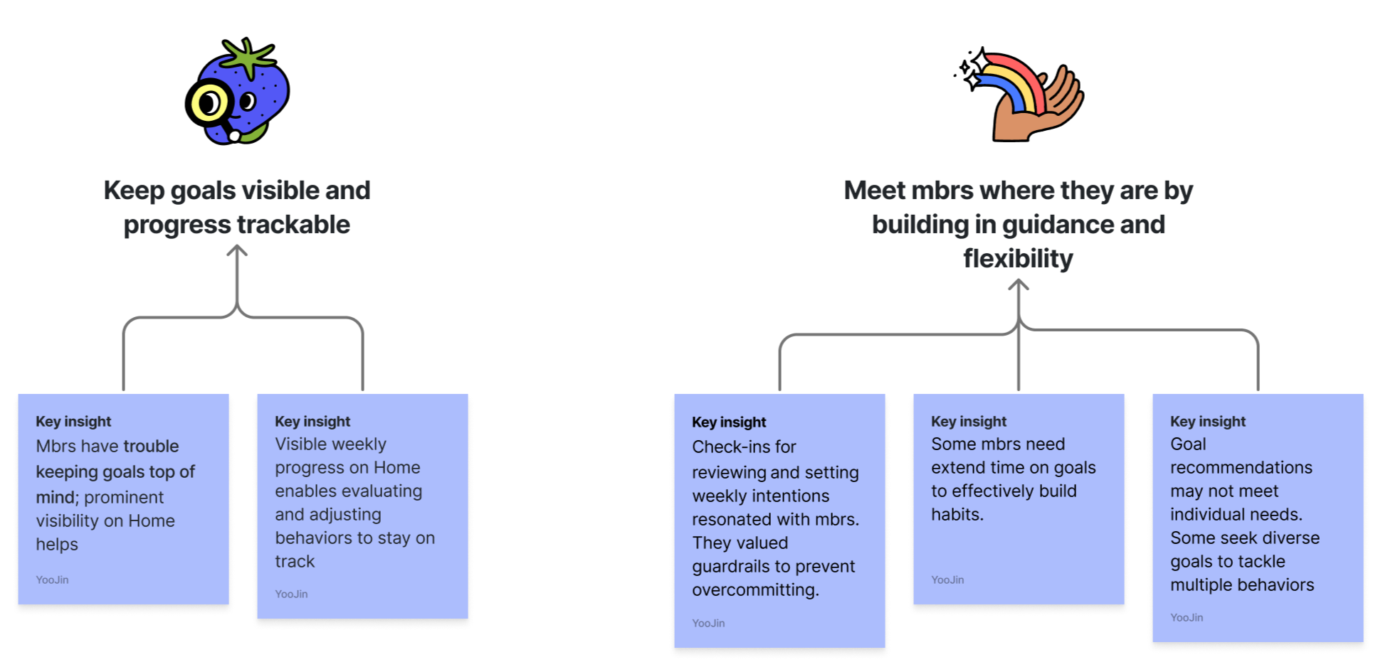
The key findings from the research shaped three design priorities
P1— Enhance tracking goals in Home.
P2— Support managing multiple goals to prevent overcommitment .
P3— Provide flexibility in extending goals when creating or finishing a goal.
Research pointed to a few clear gaps on Home: goals weren't visible enough, tracking took too many taps, progress showed as plain text, and members didn't like the locked card view in the carousel.
For members building healthy habits, that friction made it easy to lose sight of what they were working toward. With multiple goals in the picture, Home needed to do more.
What needs to be improved:
Making goal visible: finding the right place for multiple goals on Home
How tracking works: redesigning the goal card to make it simple and fast
P1 — Enhance tracking goals in Home
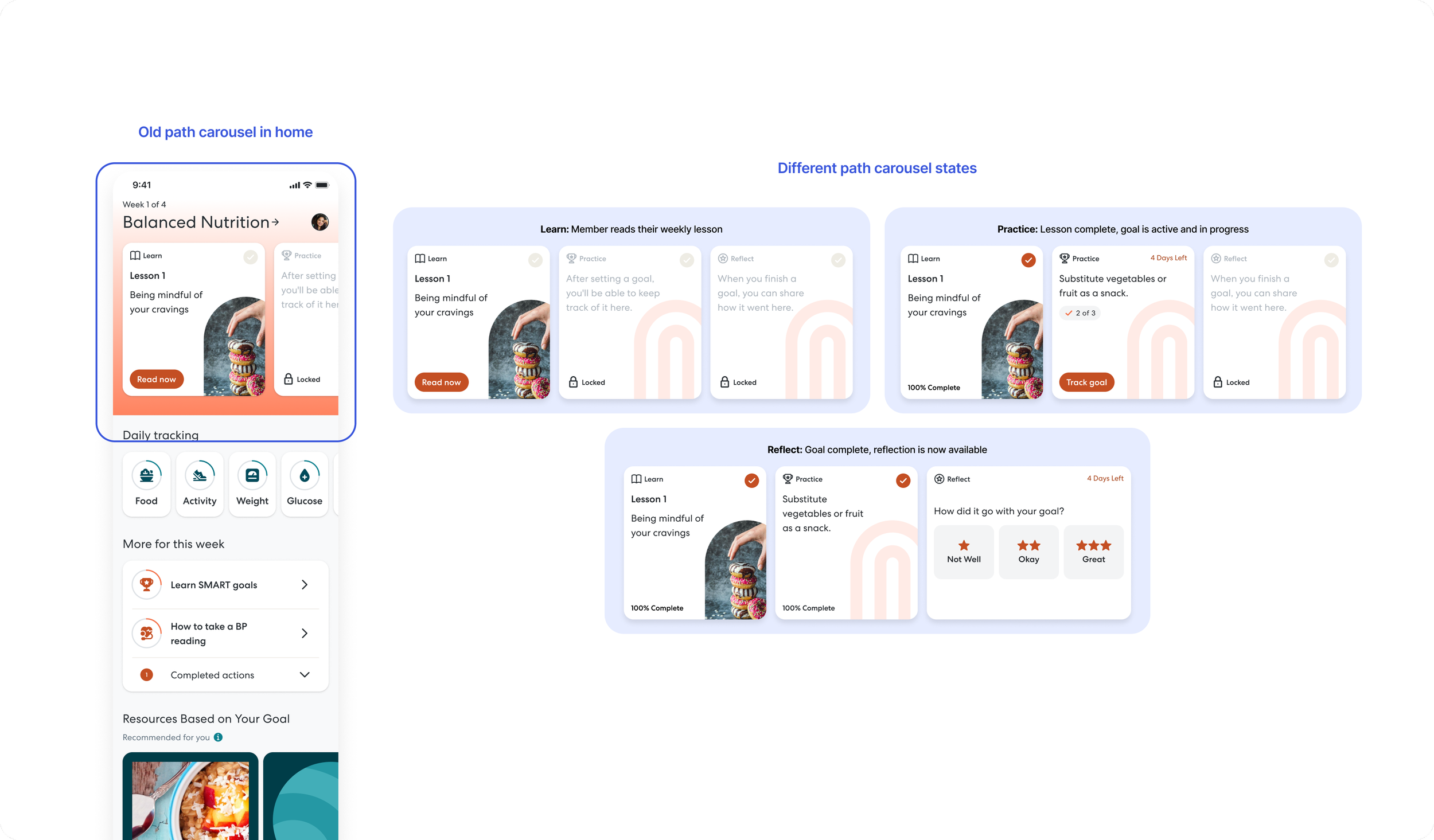
Make Goal Visible: how it currently works
The existing carousel was built around a guided behavior loop: Learn, Practice, Reflect. Each card unlocked only after the previous step was completed.
Learn: Member reads their weekly lesson
Practice: Lesson complete, goal is active and in progress
Reflect: Goal complete, reflection is now available
This carousel behavior was intentional, but it wasn't working. Research showed members felt restricted by the locked cards, and many didn't understand why the carousel worked that way at all. That gave us room to rethink what the carousel was actually for.
Redesigning the structure
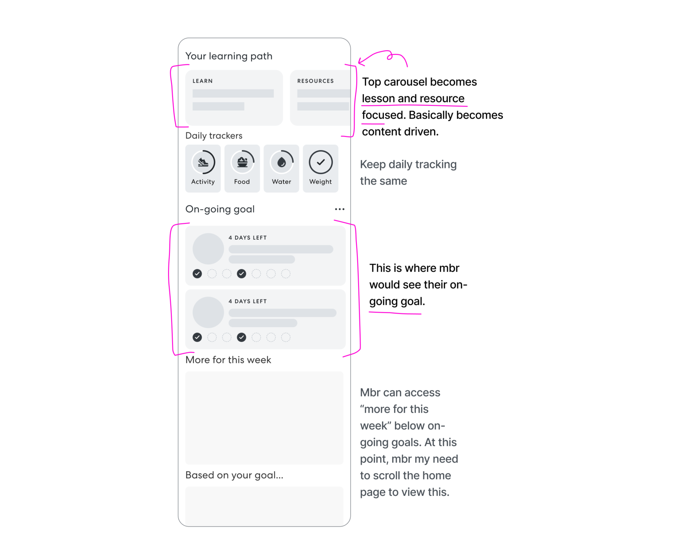
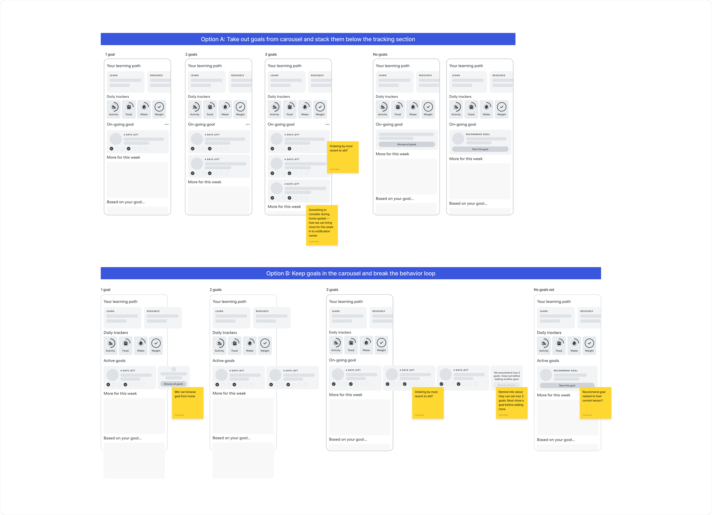
Option A: Pull goals out of the carousel and stack them below daily tracking.
The carousel stays focused on lessons and resources. Goals get their own section below.
It looked promising at first. Goals were visible on login and easier to track. But stress testing with 3+ goals revealed the problem: members had to scroll past daily tracking just to see their goals, and everything else got pushed further down the page. Also, there were other tiles that pops up in different experience moment that would often make entire goal section below the fold, prevent it from members seeing the goals at all when they login.
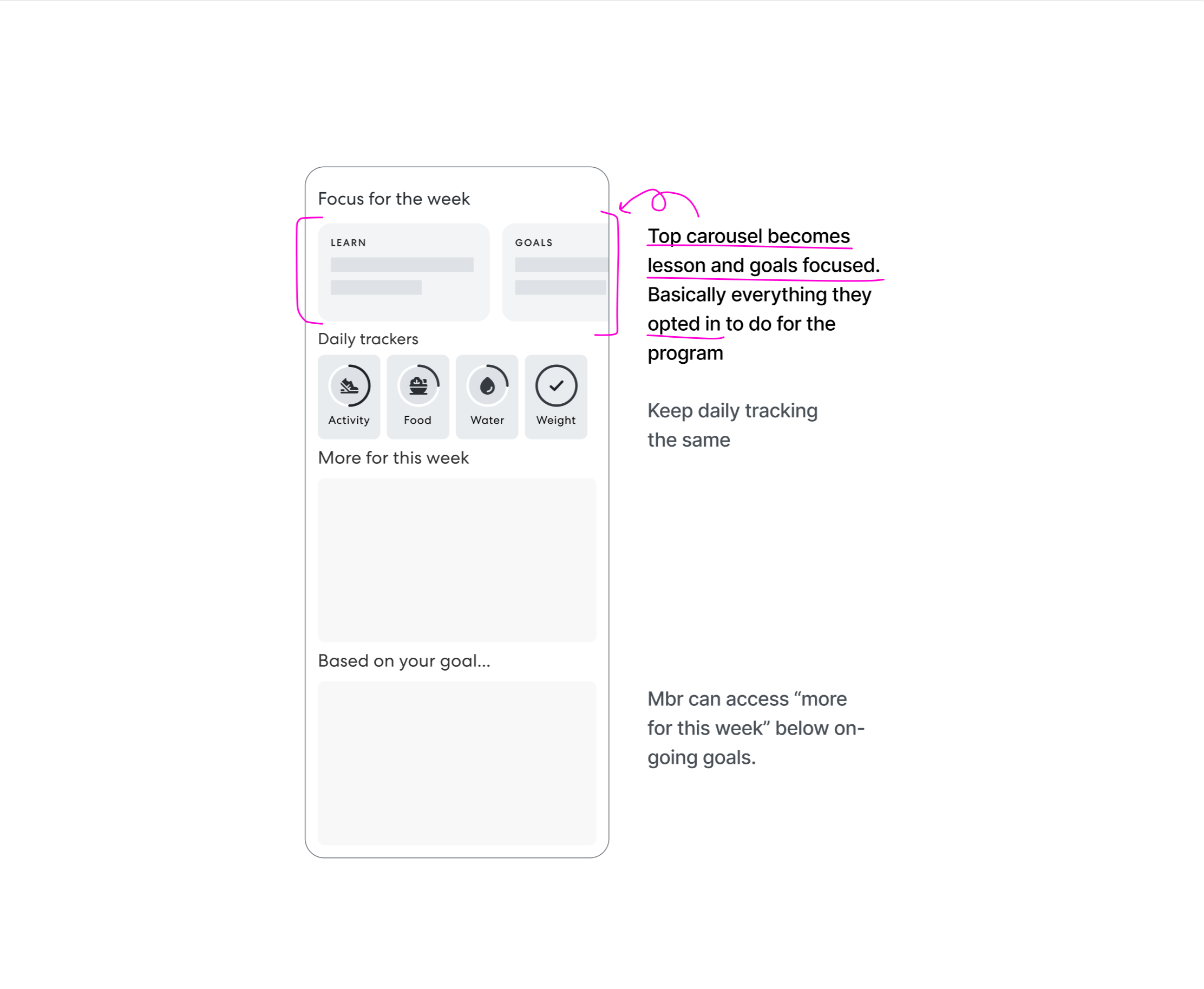
Option B: Keep goals in the carousel and redefine what it's for.
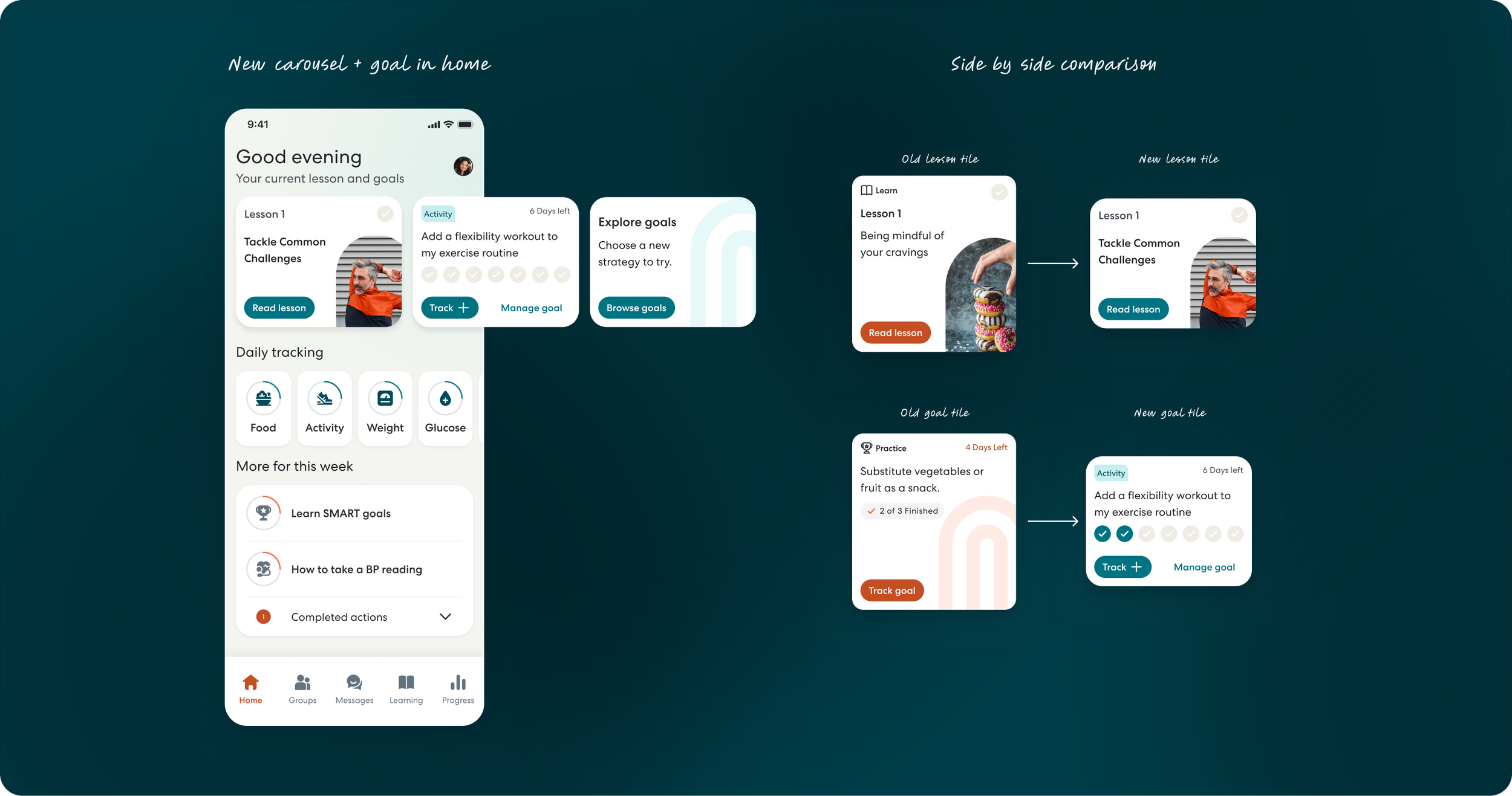
Instead of a guided path, the carousel became a home for everything members opted into: lessons and goals, together in one place. Once a lesson is completed, goals move to the front of the carousel, keeping the most relevant action always visible without scrolling.
Members could track directly from Home, and the long vertical scroll problem was avoided entirely. Breaking the behavior loop was a tradeoff, but research told us members were ready for it.
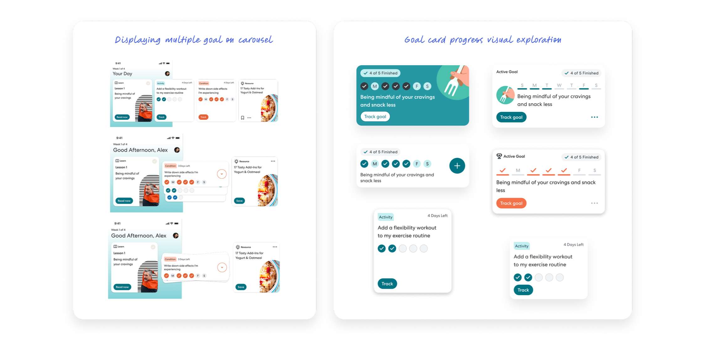
With goals now visible on Home, I turned to the goal card itself. The old card required 2-3 taps to log progress (tap card → detail page → track) and showed only flat text ("2 of 3 days").
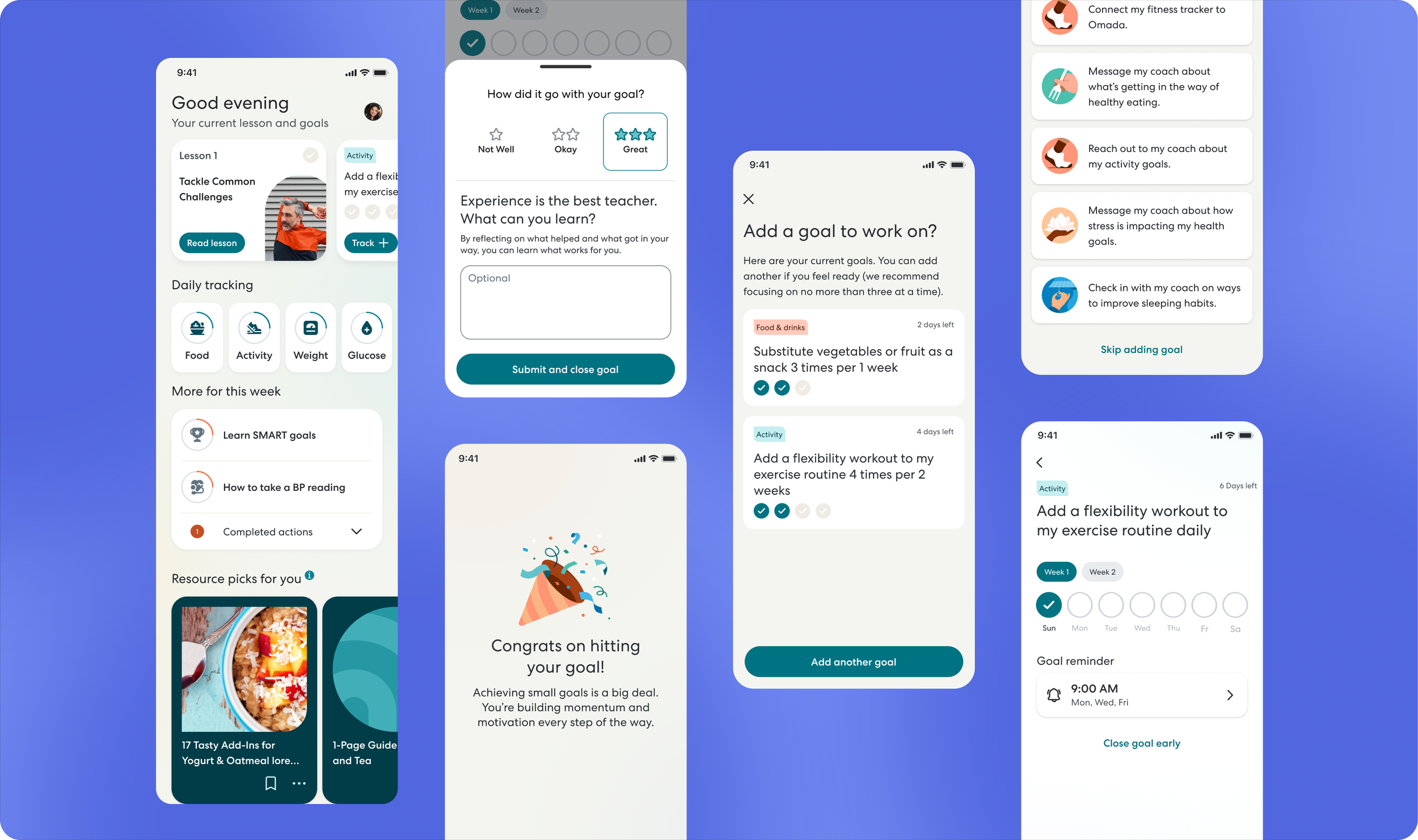
I redesigned the card so members could track in a single tap directly from Home, and replaced the text with visual checkmarks showing completed days at a glance.
Make Tracking Effortless
Updated home carousel + goal tile design
Goals are now front and center on Home, visible in one scroll alongside lessons. Members can see their weekly progress at a glance and log it in a single tap, without ever leaving the page.
P2 — Preventing Overcommitment
Omada's weekly lessons are designed to build on each other, and at the end of each one, members are prompted to set a goal based on what they just learned. It's a powerful moment. Motivation is high and the connection between learning and action is immediate. But with multiple goals now enabled, it also became a risk. Members could easily keep adding goals without pausing to consider what they were already working on.
Research showed that members already understood the risk of overcommitting. They needed a designated pause in the flow before adding more.
What needed to be solved:
Create a moment in the end-of-lesson flow for members to pause and review their current goals
Prevent overcommitment without restricting members' freedom to add new goals
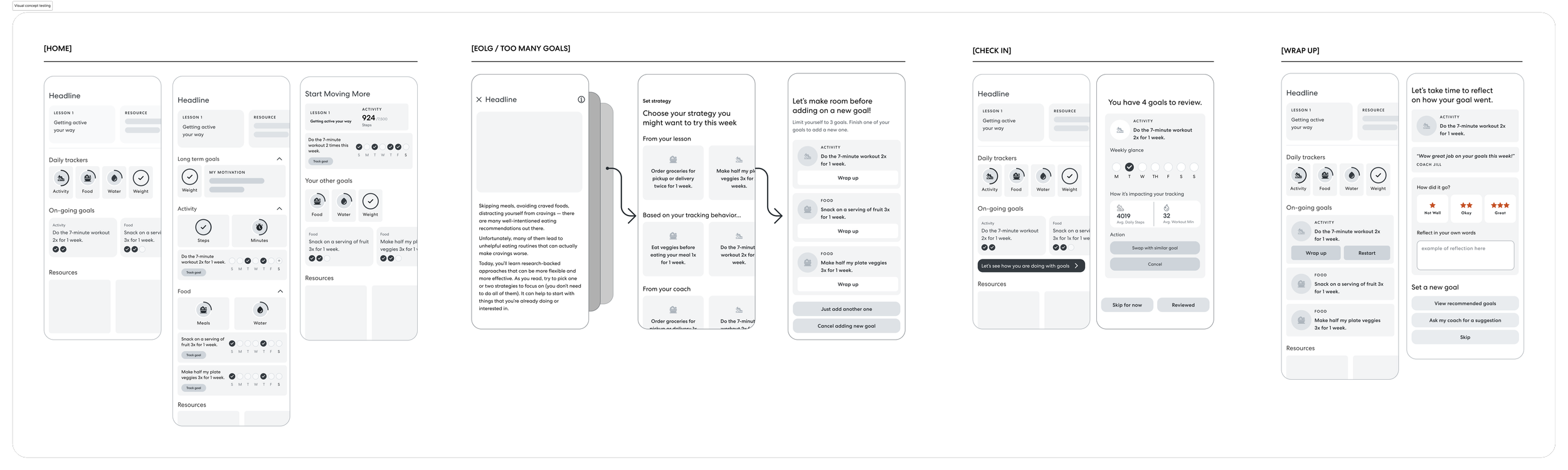
Initial Design
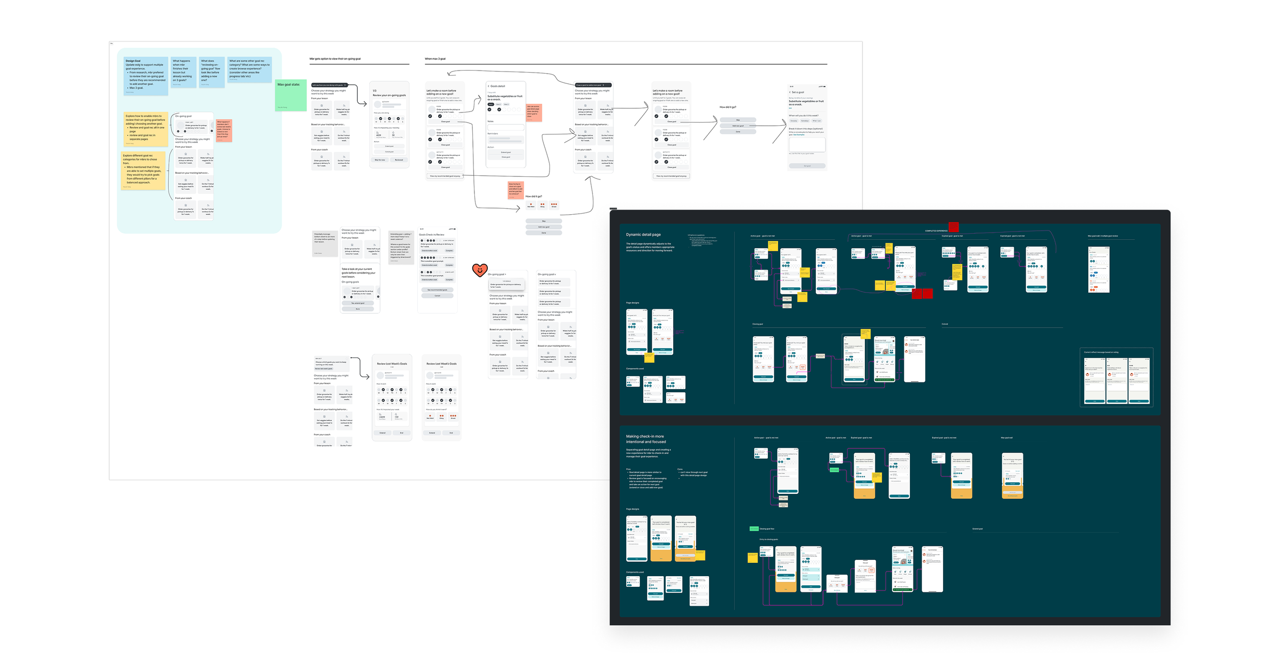
My first design tried to solve this comprehensively: a full end-of-lesson check-in where members could review every active goal, adjust difficulty, extend timelines, or close goals they'd finished, all before being shown a new suggestion. In theory, it covered everything.
The Constraint
In practice, it was too much. Engineering flagged that implementing the full check-in on top of existing goal infrastructure would require rebuilding core backend logic, a scope that would have delayed the entire project. More importantly, it was trying to do too many things in one moment.
The Solution
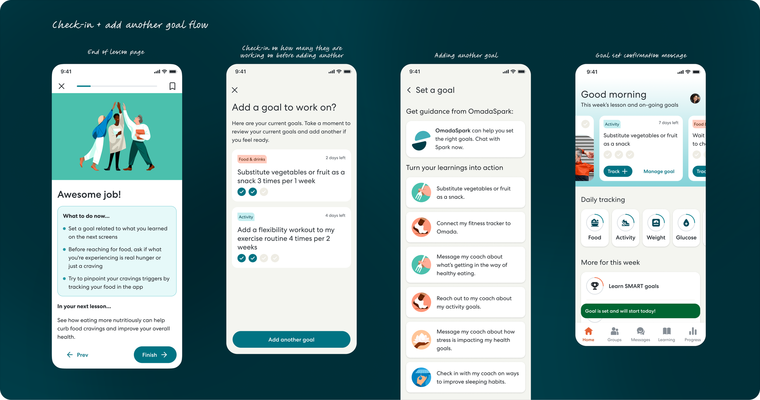
I scoped it back to its core purpose: show members what they're already working on before suggesting something new. A simple awareness checkpoint, nothing more.
Extending and adjusting goals didn't get cut from scope entirely. It just didn't belong in that moment. That work found a better home at the natural endpoint of a goal, which became part of the goal completion flow work.
That simplicity turned out to be the right call. Members didn't need to manage their goals in that moment. They just needed a nudge to be intentional. The check-in created that pause without adding friction, and all the goal management actions like extending, adjusting, and closing goals remained accessible through other entry points members already knew.
Simplified management
When a goal ends, members reach a natural decision point: keep going, try something harder, or close the loop and move on. For a product built around behavior change, that moment matters. It's where habits either deepen or dissolve.
This was also where extending goals finally found its home. Scoped out of the check-in flow in Challenge 2, it turned out the end of a goal was the right moment for it all along. Members had just finished something. They had real information about how it went, and the context to decide what to do next.
P3— Rethinking goal completion
Challenge
The old system didn't treat it that way. Goals were capped at one week with no real path forward, and the only reflection experience lived in the locked "Reflect" card we removed in Challenge 1. By breaking the linear loop, we'd created a gap.
Two things needed to be solved:
Give members a way to continue working on a goal beyond one week
Find a more contextually relevant home for reflection, tied to the natural endpoint of a goal rather than an arbitrary schedule
Initial Design
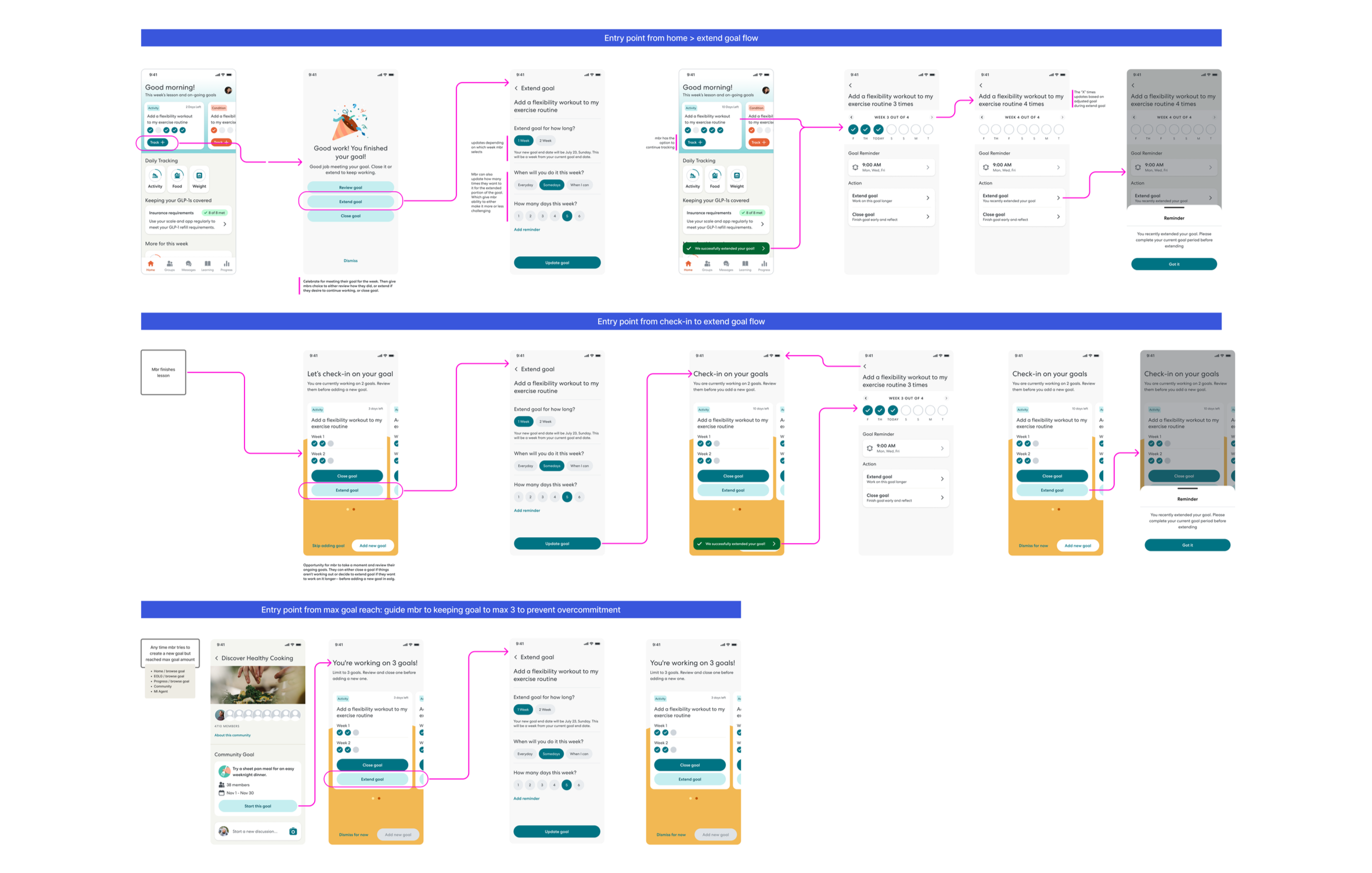
My first design was straightforward. When a goal finished, members could either close it, triggering a reflection prompt, or extend it for two more weeks. Clean, simple, covered both needs.
The Constraint
Engineering flagged that truly extending a goal meant updating an existing goal's timeline while preserving all tracked progress. For that to work, the backend had too many dependencies on that data to make it feasible without a significant rewrite.
Solution to goal extension
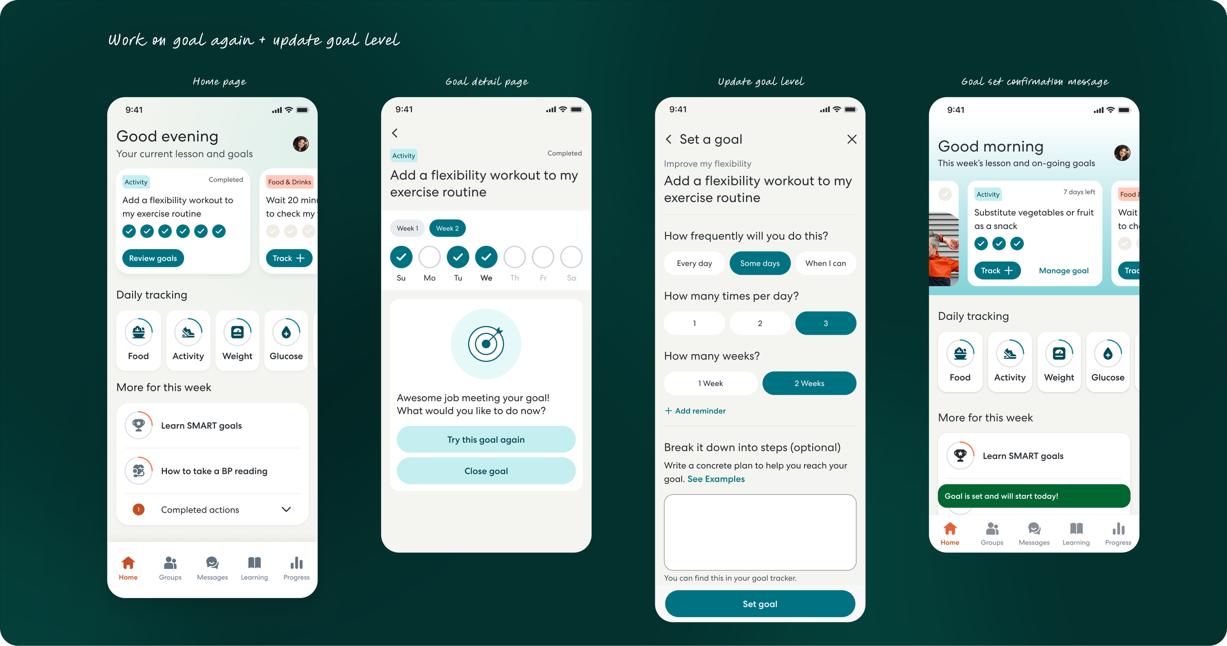
I went back to Engineering and we worked through it together. Instead of extending the existing goal, what if members could simply start it again? A fresh instance, same goal, clean slate for tracking. No backend rewrite needed.
As we talked through the implications, something unexpected surfaced. Starting fresh meant members could also recalibrate, adjusting difficulty up or down based on how the first week went, and choosing between a 1 or 2-week duration. Neither of those options existed in my original design. The constraint had led us somewhere better.
Simplified reflection flow
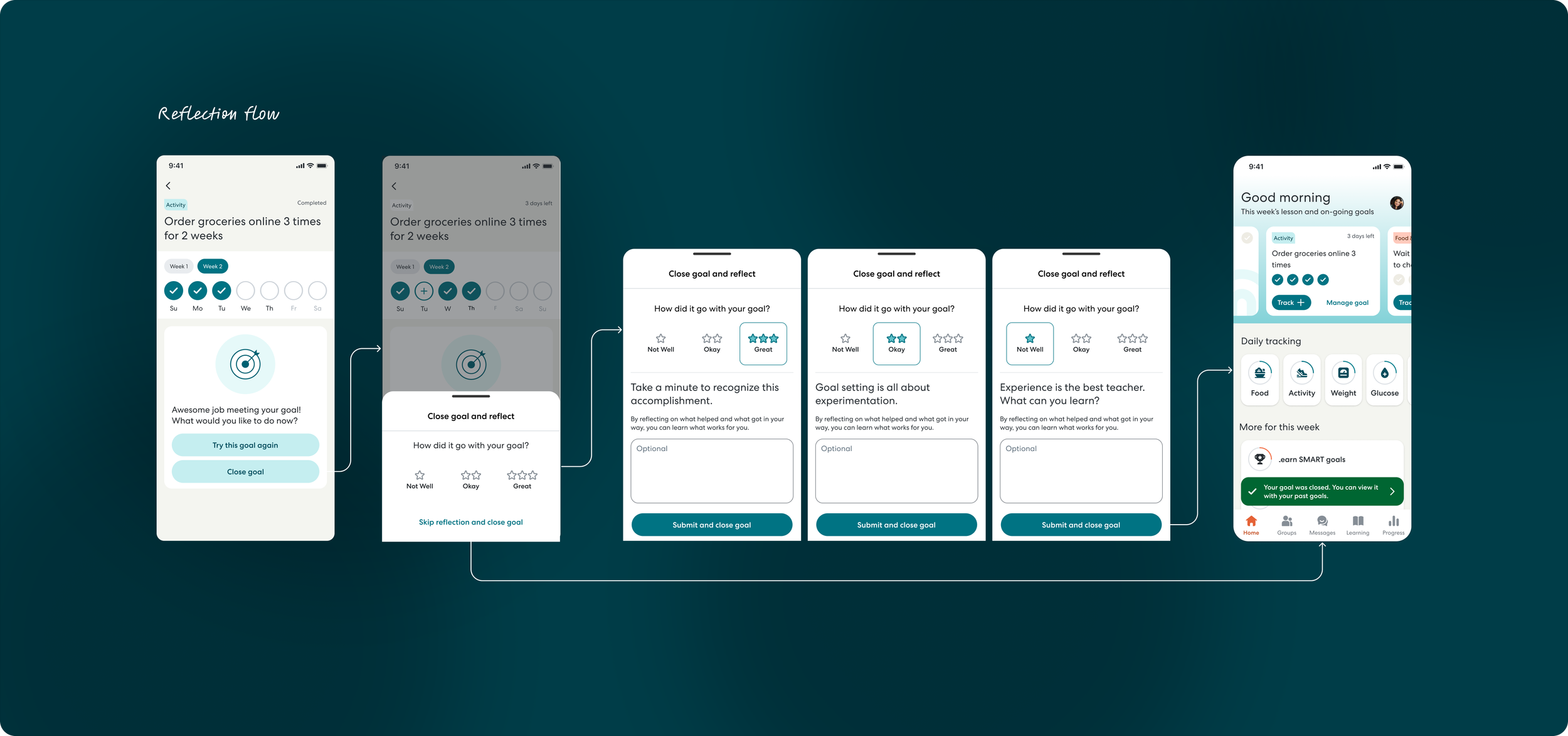
The reflection moment found its home here too. Closing a goal now triggers a reflection prompt at exactly the right time, when the experience is still fresh and members are naturally pausing to evaluate. Not locked behind a carousel card, not on a fixed schedule. Just at the moment it actually makes sense.
Impact
We measured success through subsequent goal-setting, the rate of members returning to set another goal, as an early signal of engagement and retention.
Both metrics exceeded target.
📈 Subsequent goal-setting (new members): 62.5% → 73.6%
📈 Subsequent goal-setting (all members): 67.6% → 76.8%
What I'd Do Differently
Start with engineering constraints earlier in exploration
I spent time designing the comprehensive check-in flow before fully understanding backend limitations. In retrospect, I should have done a technical feasibility check with Engineering during the exploration phase, not after presenting the initial design. This would have saved iteration cycles and allowed me to design within constraints from the start.
Test the "Browse goals" entry point more thoroughly
While we deprioritized this feature for the MVP, goal discovery deserved more attention. Members needed clear pathways to add goals, and we relied heavily on end-of-lesson prompts. A more robust browsing experience earlier might have improved adoption even further.